Interface Feedback Guideline Overview
Guidelines
Interface feedback provides reactive responses and contextual information that help instill trust in the system.

Notifications vs. Interface Feedback
While notifications and interface feedback communicate using similar patterns, they have two key differences.
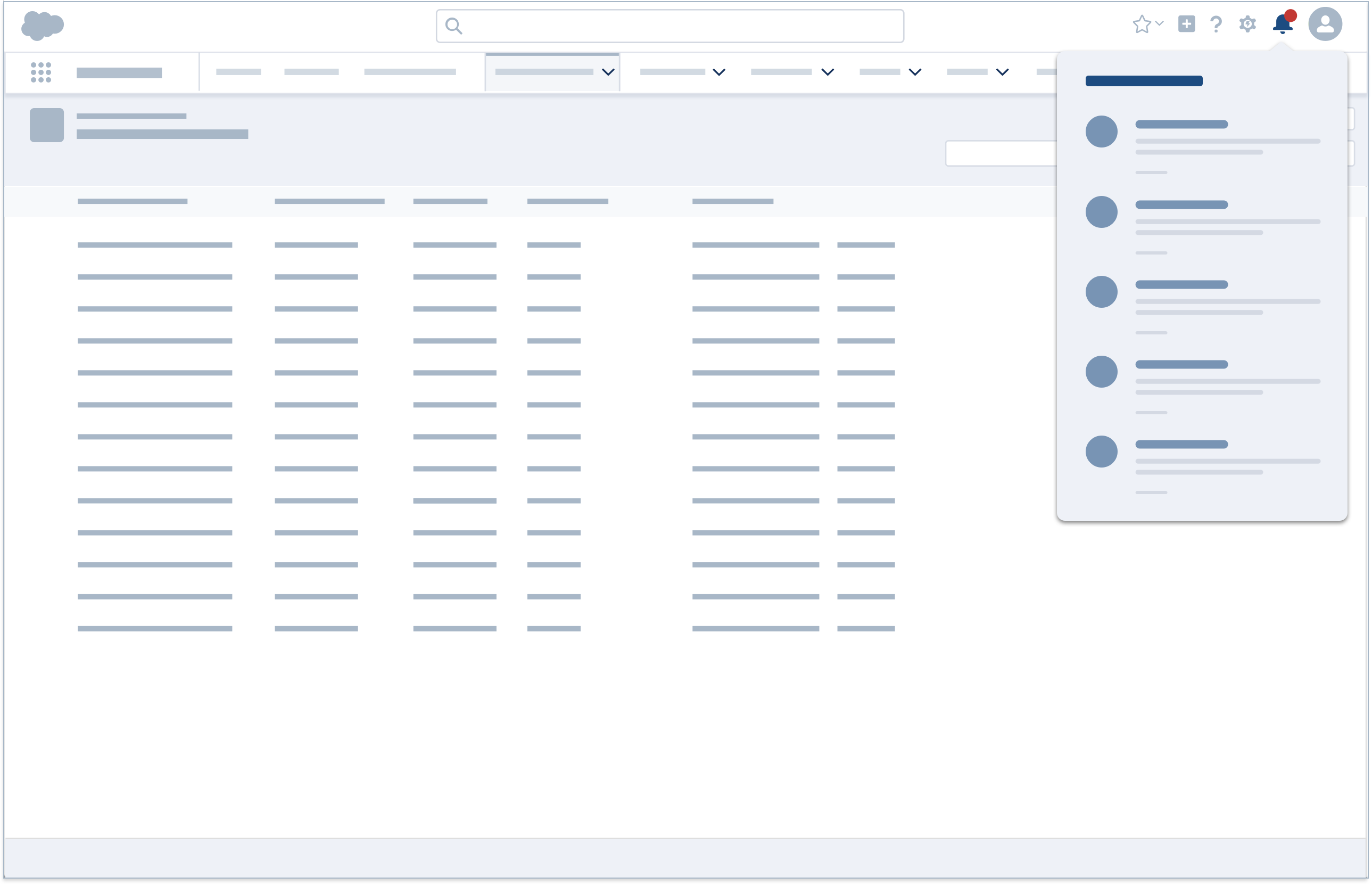
- Notifications are traceable, meaning a user can view or dismiss a notification, and revisit its content later. Dismissed interface feedback however, is not retrievable.
- Interface feedback is the system's response to direct user input—for example, a confirmation toast confirming a record change. Notifications, on the other hand, are not always reactive and not necessarily system driven.
Feedback Types
There are four types of feedback: system, engagement, access, and standard.
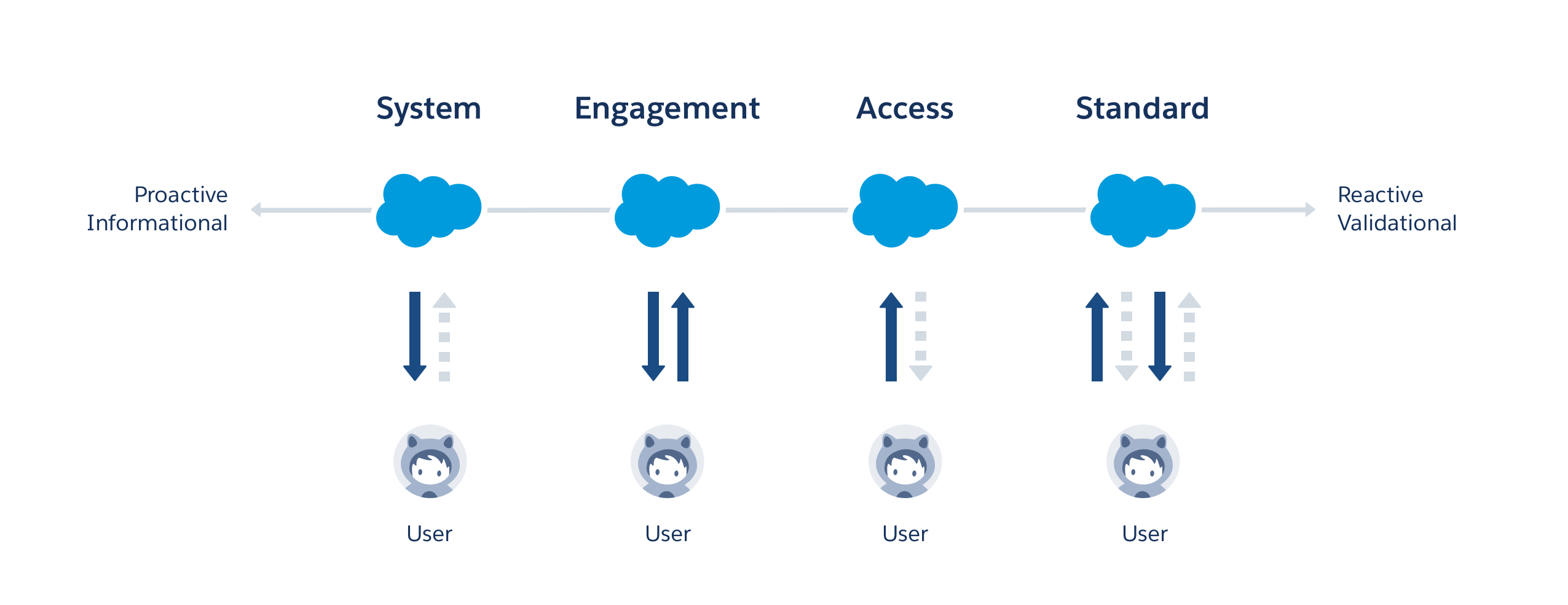
At the highest level, feedback types are categorized by user interaction type:
- System feedback alerts users to important system-level issues or statuses. It's initiated by the system, not a result of user actions.
Example: System maintenance this weekend. - Engagement feedback nudges users to update data or explore a new feature.
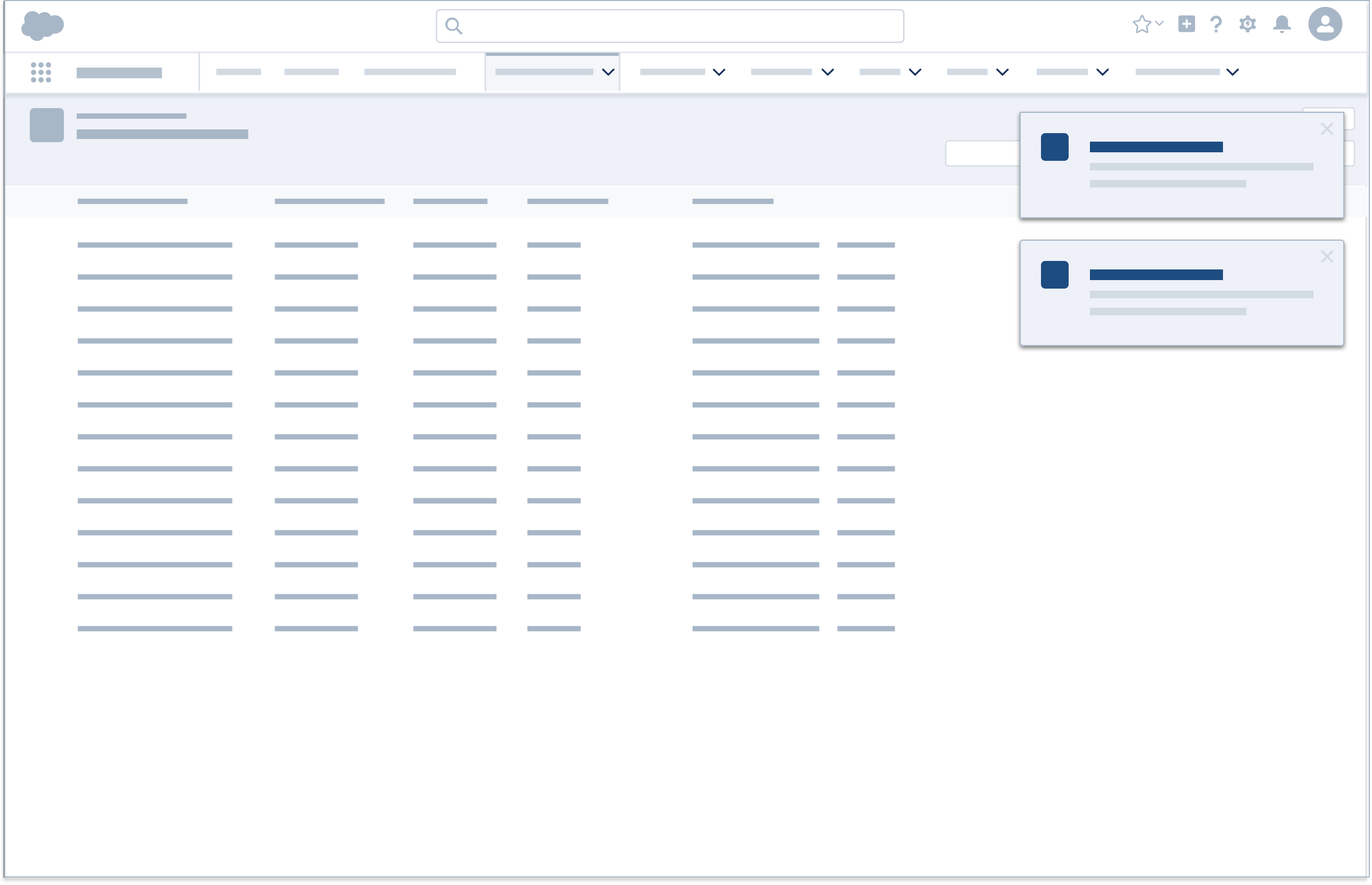
Example: No activity on Opportunity X in the past 30 days. Create a task or schedule an event. - Access feedback appears when users try to access unavailable items, perhaps because a record has been deleted or the user doesn't have access to certain data.
Example: Lead X unavailable. - Standard feedback responds to most create, read, update, and delete (CRUD) actions.
Example: Account created.
Optimizing the Feedback Experience
Here are three simple steps to help make the feedback experience both relevant and helpful.
- Select the appropriate feedback type based on user's interaction with the application.
- Pick a pattern from the category that makes sense given the user flow and UI, and has the appropriate visibility ranging from discrete to urgent.
- Determine which state best characterizes the feedback message.
| Feedback Type | Inline Text | Popover | Toast | Alert | Illustration & Inline Text | Modal | Prompt | Docked Composer | |
|---|---|---|---|---|---|---|---|---|---|
| 1 | System | Yes | Yes | Yes | Yes | ||||
| 2 | Engagement | Yes | Yes | Yes | Yes | Yes | Yes | ||
| 3 | Access | Yes | Yes | ||||||
| 4 | Standard | Yes | Yes | Yes | Yes |
Feedback Design Principles
Keep these principles in mind when designing feedback:
- Timely, not noisy. Provide feedback at the right time. Not every interaction requires feedback.
- Informative, not verbose. Say what's necessary and not much more.
- Actionable, not static. Enable shortcuts for relevant actions to improve efficiency.
- Cross device, not duplicative. When appropriate, alert users on all their devices, but clear the message once a user has read it.
Icons
Icons may be used in feedback components. Follow these guidelines when deciding which icon to use:
| Icon | Use When | ||
|---|---|---|---|
| 1 | Error | Something is wrong | |
| 2 | Info | More information is available | |
| 3 | Offline | User is in offline mode | |
| 4 | Success | An action has been completed | |
| 5 | Warning | There may be a problem | |
| 6 | User | A user-related message is shown | |
| 7 | Wrench | A maintenance-related message is shown |
Determining Feedback Characteristics
A salesperson finalizes a sale, but some of the initial numbers have changed. She updates the record. How should the application confirm that the record is saved?
- To determine the feedback type, look at the user interaction flow:
- The user initiates the interaction.
- The record is accessible, and the user successfully saves changes.
- Feedback type: Standard
- Choose from the four standard feedback components:
- Inline text is used for empty and inaccessible states, field-level error messages, and in-between states such as saving and loading. (Use a more prominent component for success messages.)
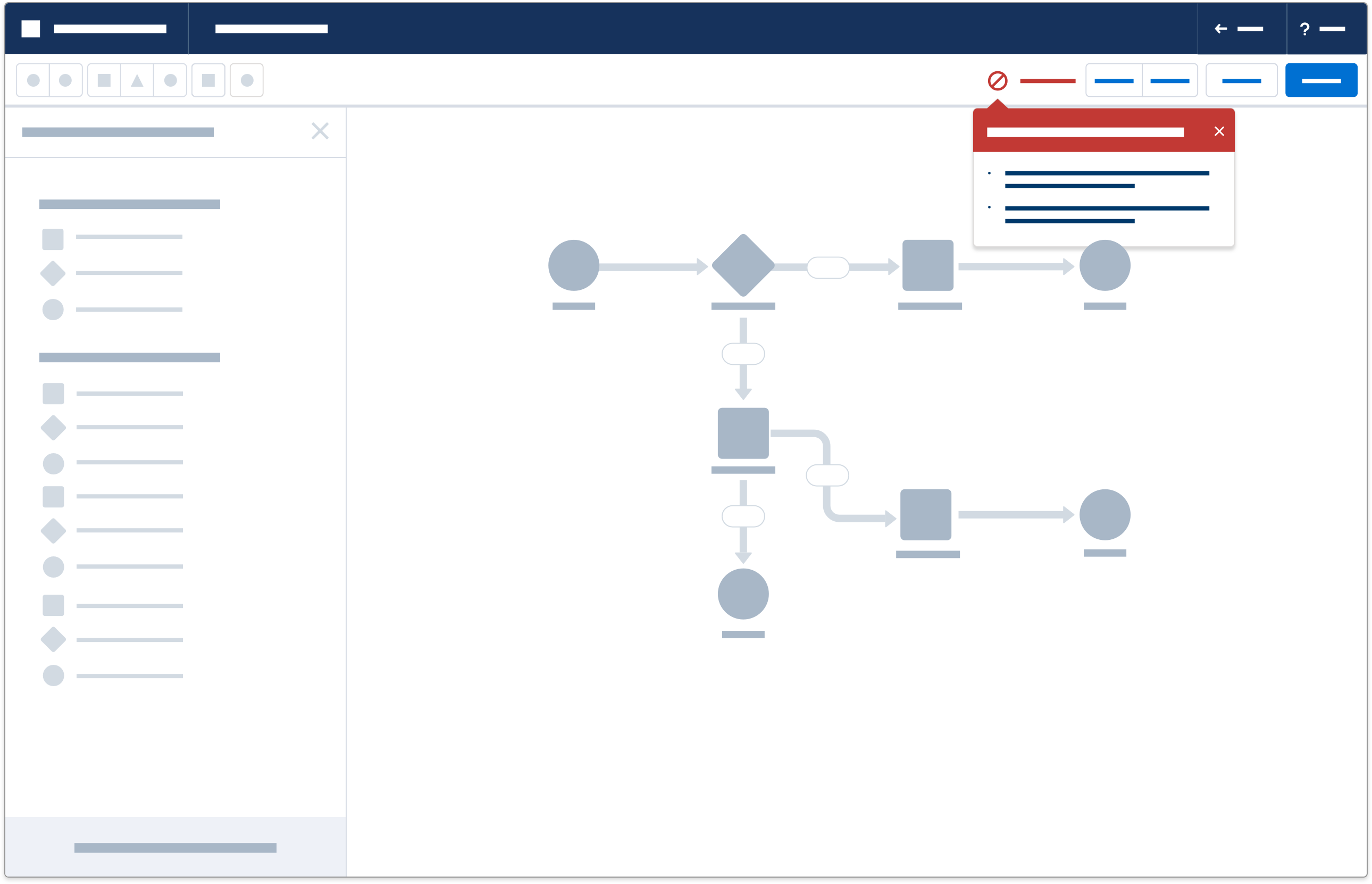
- A popover suggests a user action or communicates an error after the user submits data.
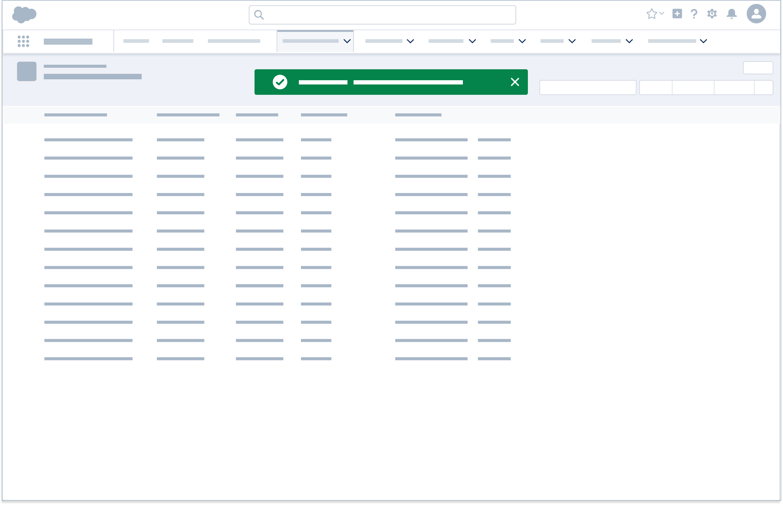
- A toast confirms a create, edit, or delete action.
- A modal warns the user, confirming that an action is intentional, not accidental.
- Feedback component: Toast
- Determine the feedback state.
- In this case, the user has successfully saved changes to the record.
- Feedback state: Success
Based on this analysis, the application should show a success toast.