Rules, Filters, and Logic Guidelines
Guidelines
Build interactions that let users find the information they need, when they need it, and confidently take action (no matter how complex).

Introduction
Salesforce enables users to store, sort, and take action on large, complex datasets. Whether creating rules to control when an action is executed or querying for a filtered set of records, logical expressions should be easy to read and manipulate. Giving users confidence while working with their data enables them to use the full capabilities of Salesforce to run their business.
Create intuitive interfaces for working with rules, filters, and logic—no matter how complex—using a thoughtful combination of Lightning Design System components.
Invisible, Intuitive, Powerful
At its best, the interface elements for these logical expressions are virtually invisible. By making the logic visual and intuitive, users can think fluidly about the shape and content of their data.
A user might think, “I want to find sales leads in the Southwest United States, in industry X, with an onsite user base of at least 50 people, that we have approached but not closed a deal with.” She might then want to sort the results geographically, by date of most recent contact, or in one of a dozen other ways. And if she doesn't find what she needs, she should be able to understand how to change her search so she can.
Filtering Data, Taking Action
Often, logical expressions define a condition that triggers an action. For example, the results of a search might trigger one of a set of X customized emails, but only if a customer has added product Y to his online shopping cart, and left it there for more than Z hours.
Automation like this is powerful! Users need a high level of confidence that systems will work as intended. The proper combination and use of components not only gives users the tools they need, it keeps the configuration readable. And that lets her be faster, more creative, and more successful in her job.
Start using our Design Kits
Open in FigmaUsage
If users will be doing any of these tasks, use the Rules, Filters, and Logic guidelines to create an understandable and approachable interface:
- Setting conditions that will determine a value or execute an action
- Creating complex if/else logic without code
- Selecting rules to show results from a dataset
- Filtering down results based on user-determined criteria
Don't use these guidelines to build workflows or business processes with multiple conditions. Consider the Builder framework instead.
Rules, Filters, and Logic Elements
A key part of constructing interfaces for logical expressions is only presenting the necessary elements. To decide which components and tools are right for a particular situation, consider what the end user will be able to do.
| Criteria | No | Yes |
|---|---|---|
| Can users add their own rules? | Use a simple search input and show any available facets. | Use the expression component to allow users to add their own logical expressions. |
| Is the logic mode connecting the rules customizable (e.g. all conditions are true, any condition is true)? | Logic should be "all conditions are met" by default. Do not show a toggle for the logic mode. | Use the expression component to show a toggle for the logic mode and allow users to change it to any available option. |
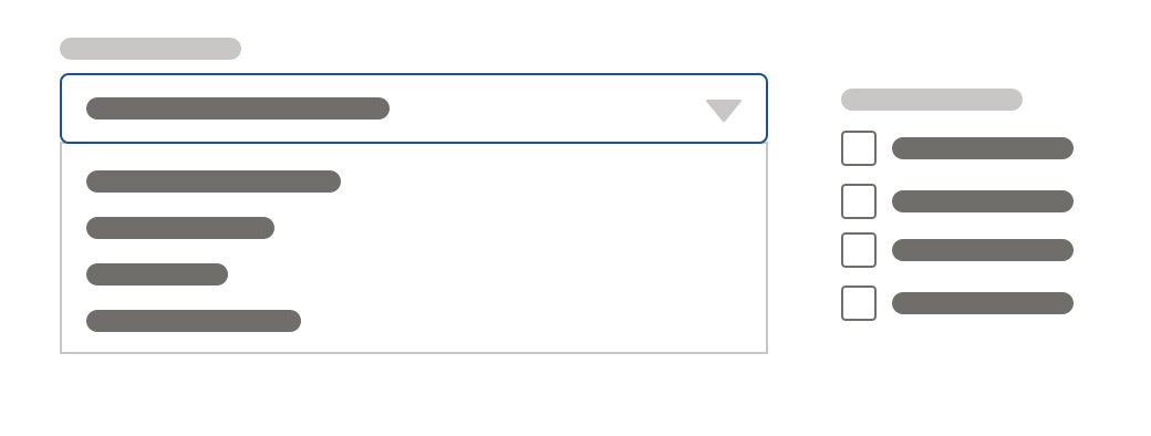
When users are not adding their own rules and cannot change the logic mode, use components such as combobox, dueling picklist, select, and text input. These simple and familiar elements will give users fast access to their desired results.


When users are creating more advanced logical expressions—like adding their own rules or changing the logic mode—use the expression component to enable users to construct their logic in an intuitive fashion. The power of this component is in being able to scale the interface to meet the complexity of the task. Optional variations exist to help users understand the functionality available to them.
- When only 2-3 logic modes are needed, and one more includes a formula, the modes can be surfaced as a radio button group instead of a picklist.
- When vertical space is a concern—like when many instances of these logical groups might exist in the same area—you can nest the expression component inside of a collapsible wrapper.

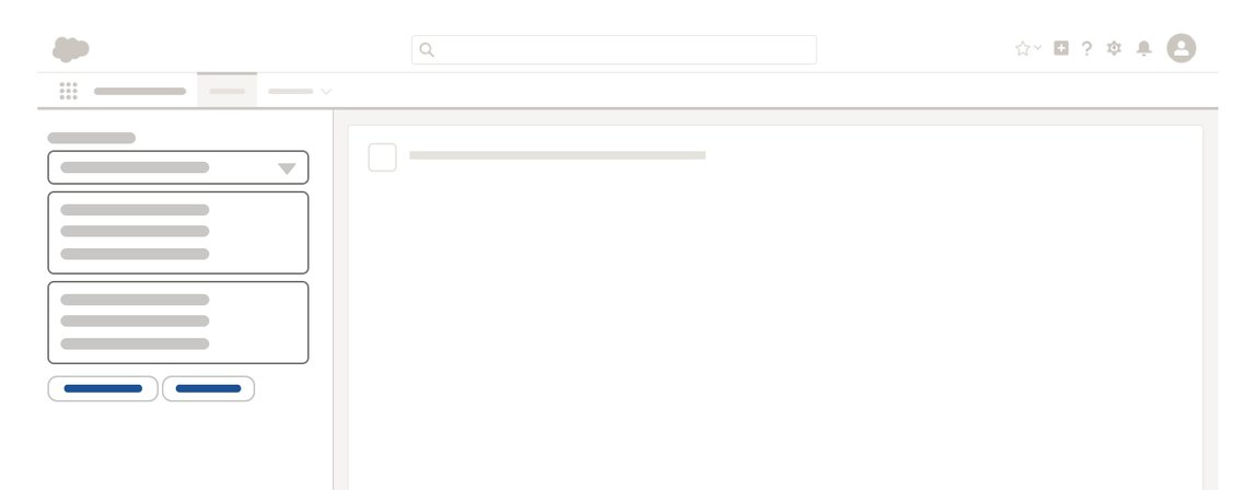
In any of these cases, you can use a panel and narrow variant of the expression component to contain these elements when horizontal space is limited, or when you can immediately preview the results on a larger part of the layout.
Find the right combination of components to give your users the functionality they need for the task at hand without overcomplicating the interface and causing confusion.